Page loading


Flyer
-

 Authors
-
Chronological
- • 1977 (1-12)
- • 1978 (13-23)
- • 1979 (24-27)
- • 1980 (28-39)
- • 1981 (40-52)
- • 1982 (53-64)
- • 1983 (65-74)
- • 1984 (75-97)
- • 1985 (98-114)
- • 1986 (115-120)
- • 1987 (121-127)
- • 1988 (128-134)
- • 1989 (-)
- • 1990 (135)
- • 1991 (136-138)
- • 1992 (139-144)
- • 1993 (145-153)
- • 1994 (154-163)
- • 1995 (164-172)
- • 1996 (173-188)
- • 1997 (189-194)
- • 1998 (195-196)
- • 1999 (197-201)
- • 2000 (202-206)
- • 2001 (207-213)
- • 2002 (214-220)
- • 2003 (221-224)
- • 2004 (225-226)
- • 2005 (227-229)
- • 2006 (230-231)
- • 2007 (232-237)
- • 2008 (238)
- • 2009 (239-247)
- • 2010 (248)
- • 2011 (249-251)
- • 2012 (252-255)
- • 2013 (256)
- • 2014 (257)
- • 2015 (-)
- • 2016 (258-260)
- • 2017 (261-263)
- • 2018 (264-269)
- • 2019 (270-273)
- • 2019 (274-276)
- • 2021 (277)
- • 2022 (278-281)
- • 2023 (282-284)
- • 2024 (285-285b)
- • 2025 (286-288)
- • 2026 (289)
-
Des barbares...
-
Biblioteratology
- • 01. Chez les brocheurs [1]
- • 02. Chez les éditeurs[1]
- • 03. Chez les relieurs [1]
- • 04. Chez les relieurs [2]
- • 05. Chez les éditeurs [2]
- • 06. At the readers [1]
- • 07. Chez les éditeurs [3]
- • 08. Chez les éditeurs [4]
- • 09. Chez les éditeurs [5]
- • 10. Chez les relieurs [3]
- • 11. At the bookstores [1]
- • 12. Among layout designers [1]
-
Entertainments
-
Fin-de-Siècle
-
Fourneau and Fornax
-
Printings
-
Typography


est un éditeur artisan établi en Champagne (dans le petit village de Bannes)
qui a aussi eu pendant 26 ans un atelier en Île de France (dans le petit village de Paris),
mais ne l'a plus.


L'atelier de Bannes.

“That's it! You've gone and wasted more money on something you don't need…”
“Er, what's it to you, you miserable little twerp?!”
“…None of my business, I know, and I absolutely love sticking my nose into things that don't concern me. I admit it! So you've bought yourself another book…”
“…for my technical library, yes. And your point is…? What's wrong with that? And I would appreciate it if you addressed me as ‘Sir’ from now on. A simple matter of respect, on your part.”
“Well, as I understand it, the book you've just bought is one you've already got… in photographs, I mean, photos you took yourself…”
“I see our little twerp is rather well informed. What he doesn't seem to understand, however, is the difference between reality and an image of reality. As Comrade Korzybski puts it—and he's not the only one—‘The map is not the territory.’ And a picture of a book is not the book itself. It has none of the book's weight, its feel, its smell… And there is far more pleasure in leafing through a real book than in scrolling through pictures on a screen, which, on top of everything else, may tire your eyes—or at the very least tire them a good deal more than reading a good book by the light of a good candle…”
“A good candle…”
“Yes, or, if you're a thoroughgoing modernist, by the light of a not-too-bright electric lamp. And, needless to say, while sitting comfortably in a nice, soft armchair.”
“Well, well! You certainly know how to tell us things…”
“Go on, mock me, mock me, you ignorant Philistine… always glued to one screen or another.”
“I imagine, Sir, that you are also partial to making notes on fresh clay tablets with a wedge-shaped reed.”
“Well now! Perhaps you're not quite the Philistine I took you for, since you seem to know something about the existence of cuneiform inscriptions…”
“Yeah, well, that's all very nice, but it still doesn't beat a cracking good manga downloaded from some dodgy Japanese website!”
“I shall leave you to answer for your own words… though I have my own thoughts on the matter. If you'll excuse me, I'll be off. I have more important things to do… like leafing through my new book, for instance…”
Chance—that suspicious entity which more often than not plays some thoroughly nasty tricks on us—was responsible for the arrival, just this very morning, of a book I had never dared hope to place on the shelf reserved for typography manuals in my technical library. It all began with an exchange of emails, sent using my pedal-powered computator, its brass gears painstakingly filed by hand, and connected to my hand-operated printing press by a bicycle chain. The emails were with a correspondent whose name I shall not reveal, in order to spare him any unwanted attention. We were discussing printers' correction marks. We talked about Castillon's manual (1783), Brun's manual (1825), and I mentioned Vinçard's L'Art du typographe (1806), a manual I rather like. The page devoted to printers' correction marks in Vinçard's book was not printed in good, honest, solid hot-metal type, as Brun's was, but by intaglio printing. This was despite the fact that intaglio is more expensive, more complicated, and less logical to use in a book devoted to typography. The reason is simple: it is much easier to produce the marks that way, and the result is closer to the handwritten signs used by proofreaders.
Once our email exchange had come to an end, it occurred to me to have a look at the online bookshops and antiquarian booksellers' websites to see what old typography manuals might be available. I have quite a number of them already, but there are still gaps on my shelves. Every now and then—though not very often—I check those websites, which I shall leave unnamed, to see whether one or another might have come up for sale. I do so without much hope, I must confess, because the ones missing from my shelves are precisely those that are rarest and hardest to find. Please don't take this confidence as an invitation to burgle my house: it is under electronic surveillance, and you might well get caught.
And then, there it was. A Vinçard for sale! No sooner said than done: I bankrupt myself! Well, admittedly, it wasn't the 1806 edition, but the second edition, published in 1823. Not as good. Not as complete. Revised, corrected, and expanded, yet somehow less complete than the 1806 edition. No samples of coloured inks, no examples of heavy papers coloured throughout the sheet for making covers. You know all this, of course, because you've read the wonderful book Jacques André and I wrote, Histoire de l'écriture typographique au XIXe siècle français (A History of French Typography in the Nineteenth Century). You haven't? Well, what on earth are you waiting for?
According to his own son's admission, the first edition is better than the second.
First edition: 6,000 copies, now out of print.
Second edition: print run of 1,500, of which only 1,200 were sold.
Set by Vinçard fils in a printing shop very poorly supplied with type (Hardy, rue Saint-Médéric).
Vinçard fils is one of Lacrampe's associates (see →here, in French)
His father was still alive in August 1839.
So does this second edition have nothing going for it? Of course it does! It has the merit of existing, and I have the merit of having bought it. Besides, my copy has a few rather amusing peculiarities of its own. Its binding is somewhat unremarkable and a little clumsy. There is nothing particularly noteworthy about it, unless you count the decorative border made with a roll tool—which, admittedly, isn't much to write home about either!
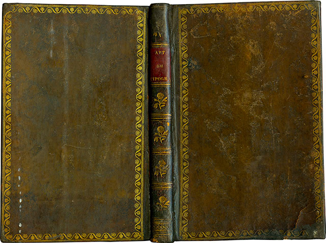
Flat binding.
The title label, however, has a particularly amusing feature, especially for a typography manual. It reads:
ART
DU
TIPOGRA
Of course, it isn't the missing PHE that makes me smile. It's the I in TIPO. One can only assume that the person who did the lettering was Italian and inadvertently followed the spelling of his mother tongue.
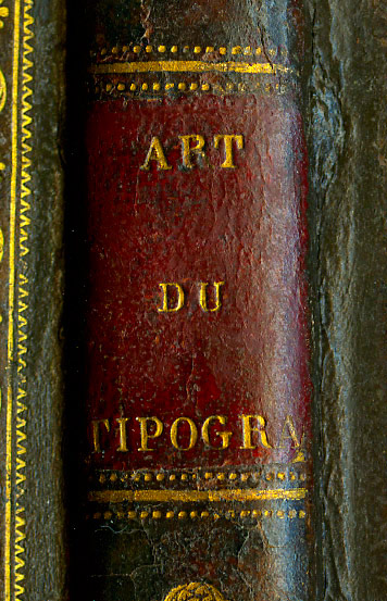
Title label.
More troublesome for me, as the new owner of this copy, is the absence of leaves 27–28, which some disrespectful two-legged creature has torn out. Fortunately, I can remedy this by copying the photographs I took of the corresponding pages in the copy held at Estienne. But this loss is compensated for—by a curious paradox—by the presence of a duplicated gathering. My copy contains two sets of leaves 49–50, 51–52, 53–54, and 55–56. Very useful, really. If you haven't quite grasped those pages the first time around, you can simply read them again without having to turn back! Had this book not been destined to rest on a shelf in my technical library, it might well have earned a place in my little library of bookish teratology—the study of bibliographical monstrosities.
Let us now forget these “peculiar peculiarities” and turn our attention to the contents of the book, and to the differences between this edition and the first. First, since this was the very subject that started the email exchange which led to my purchase, I'll show you the page illustrating the printers' correction marks. It was printed by intaglio.
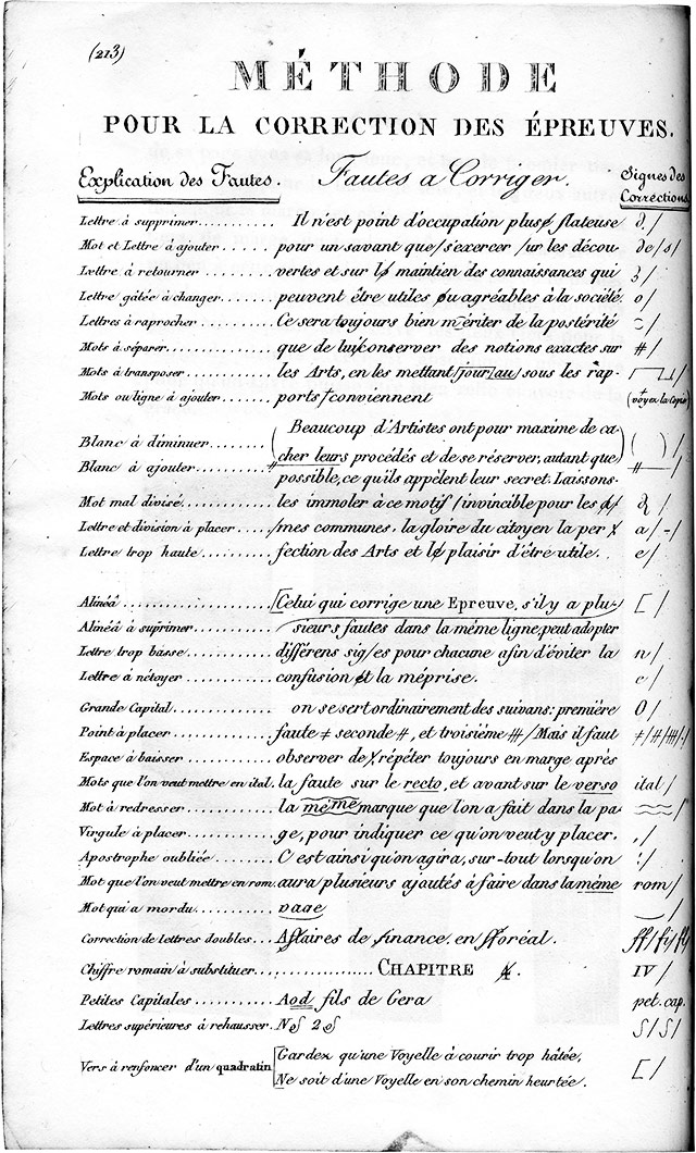
Correction marks plate.
One of the distinctive features of Vinçard and his manual, right from the first edition of 1806, is his proposal for a new type-case layout, which he called hamapolygrammatique. He had patented it as early as 1804.
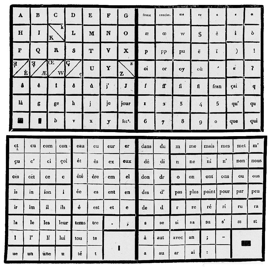
The 1804 patented type case.
Having had a second look at the complexity of his invention, he simplified it when his manual appeared in 1806, and made no further changes when the book was reissued in 1823.
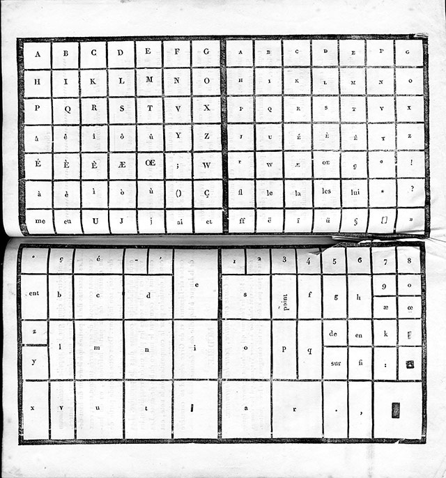
The 1823 type case.
The fact that this manual went through two editions during the nineteenth century—a period when technological developments were occurring at an almost daily pace—gives us an opportunity to observe how printing practices evolved. In 1806, ink balls were still the principal means of inking the formes, although the inking roller had made its appearance in the final years of the previous century. Vinçard's 1806 manual therefore illustrates the ink balls in much the same way as the Encyclopédie had done.
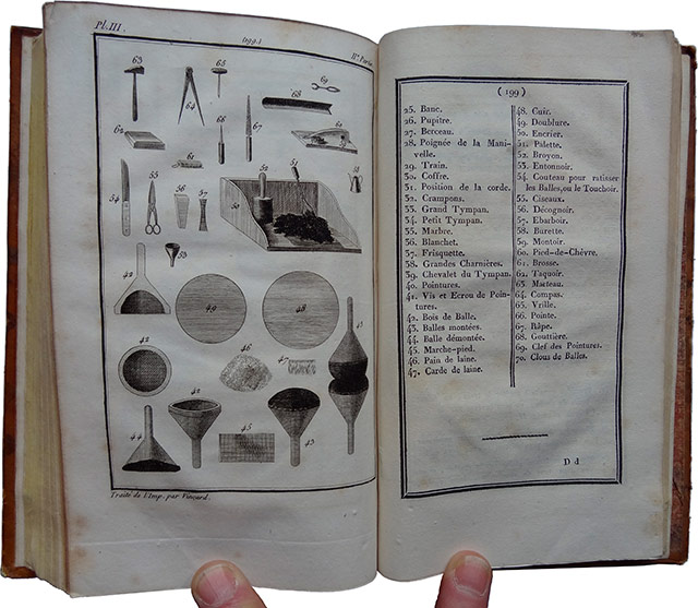
1806 plate: the ink balls. The two fingers holding the book open for the photograph belong, of course, to yours truly.
The 1823 edition has much the same illustration, more or less… but this time the inking roller makes an appearance, because by then its use had become widespread.
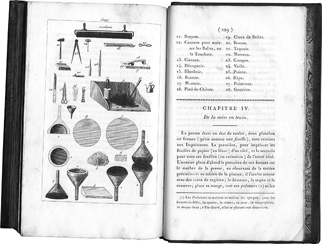
Ink balls and roller plate from the 1823 edition, with the captions on the right-hand page.
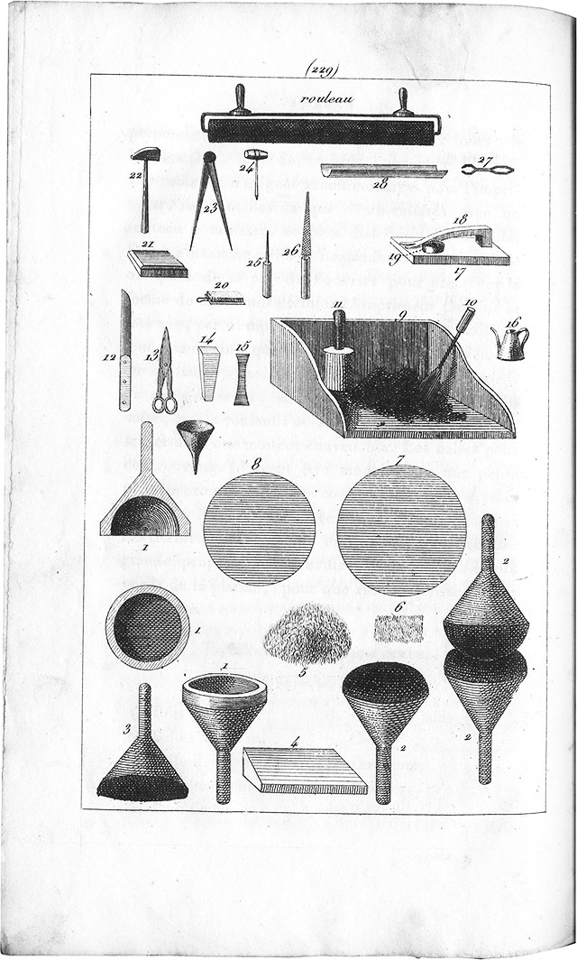
Ink balls and roller plate only.
And there we are. I have the feeling that, for once, I've been a little long-winded. I'll try to be more concise next time. Well… I hope so, anyway…
“That's it! You've gone and wasted more money on something you don't need…”
“Er, what's it to you, you miserable little twerp?!”
“…None of my business, I know, and I absolutely love sticking my nose into things that don't concern me. I admit it! So you've bought yourself another book…”
“…for my technical library, yes. And your point is…? What's wrong with that? And I would appreciate it if you addressed me as ‘Sir’ from now on. A simple matter of respect, on your part.”
“Well, as I understand it, the book you've just bought is one you've already got… in photographs, I mean, photos you took yourself…”
“I see our little twerp is rather well informed. What he doesn't seem to understand, however, is the difference between reality and an image of reality. As Comrade Korzybski puts it—and he's not the only one—‘The map is not the territory.’ And a picture of a book is not the book itself. It has none of the book's weight, its feel, its smell… And there is far more pleasure in leafing through a real book than in scrolling through pictures on a screen, which, on top of everything else, may tire your eyes—or at the very least tire them a good deal more than reading a good book by the light of a good candle…”
“A good candle…”
“Yes, or, if you're a thoroughgoing modernist, by the light of a not-too-bright electric lamp. And, needless to say, while sitting comfortably in a nice, soft armchair.”
“Well, well! You certainly know how to tell us things…”
“Go on, mock me, mock me, you ignorant Philistine… always glued to one screen or another.”
“I imagine, Sir, that you are also partial to making notes on fresh clay tablets with a wedge-shaped reed.”
“Well now! Perhaps you're not quite the Philistine I took you for, since you seem to know something about the existence of cuneiform inscriptions…”
“Yeah, well, that's all very nice, but it still doesn't beat a cracking good manga downloaded from some dodgy Japanese website!”
“I shall leave you to answer for your own words… though I have my own thoughts on the matter. If you'll excuse me, I'll be off. I have more important things to do… like leafing through my new book, for instance…”
Chance—that suspicious entity which more often than not plays some thoroughly nasty tricks on us—was responsible for the arrival, just this very morning, of a book I had never dared hope to place on the shelf reserved for typography manuals in my technical library. It all began with an exchange of emails, sent using my pedal-powered computator, its brass gears painstakingly filed by hand, and connected to my hand-operated printing press by a bicycle chain. The emails were with a correspondent whose name I shall not reveal, in order to spare him any unwanted attention. We were discussing printers' correction marks. We talked about Castillon's manual (1783), Brun's manual (1825), and I mentioned Vinçard's L'Art du typographe (1806), a manual I rather like. The page devoted to printers' correction marks in Vinçard's book was not printed in good, honest, solid hot-metal type, as Brun's was, but by intaglio printing. This was despite the fact that intaglio is more expensive, more complicated, and less logical to use in a book devoted to typography. The reason is simple: it is much easier to produce the marks that way, and the result is closer to the handwritten signs used by proofreaders.
Once our email exchange had come to an end, it occurred to me to have a look at the online bookshops and antiquarian booksellers' websites to see what old typography manuals might be available. I have quite a number of them already, but there are still gaps on my shelves. Every now and then—though not very often—I check those websites, which I shall leave unnamed, to see whether one or another might have come up for sale. I do so without much hope, I must confess, because the ones missing from my shelves are precisely those that are rarest and hardest to find. Please don't take this confidence as an invitation to burgle my house: it is under electronic surveillance, and you might well get caught.
And then, there it was. A Vinçard for sale! No sooner said than done: I bankrupt myself! Well, admittedly, it wasn't the 1806 edition, but the second edition, published in 1823. Not as good. Not as complete. Revised, corrected, and expanded, yet somehow less complete than the 1806 edition. No samples of coloured inks, no examples of heavy papers coloured throughout the sheet for making covers. You know all this, of course, because you've read the wonderful book Jacques André and I wrote, Histoire de l'écriture typographique au XIXe siècle français (A History of French Typography in the Nineteenth Century). You haven't? Well, what on earth are you waiting for?
According to his own son's admission, the first edition is better than the second.
First edition: 6,000 copies, now out of print.
Second edition: print run of 1,500, of which only 1,200 were sold.
Set by Vinçard fils in a printing shop very poorly supplied with type (Hardy, rue Saint-Médéric).
Vinçard fils is one of Lacrampe's associates (see →here, in French)
His father was still alive in August 1839.
So does this second edition have nothing going for it? Of course it does! It has the merit of existing, and I have the merit of having bought it. Besides, my copy has a few rather amusing peculiarities of its own. Its binding is somewhat unremarkable and a little clumsy. There is nothing particularly noteworthy about it, unless you count the decorative border made with a roll tool—which, admittedly, isn't much to write home about either!
Flat binding.
The title label, however, has a particularly amusing feature, especially for a typography manual. It reads:
ART
DU
TIPOGRA
Of course, it isn't the missing PHE that makes me smile. It's the I in TIPO. One can only assume that the person who did the lettering was Italian and inadvertently followed the spelling of his mother tongue.
Title label.
More troublesome for me, as the new owner of this copy, is the absence of leaves 27–28, which some disrespectful two-legged creature has torn out. Fortunately, I can remedy this by copying the photographs I took of the corresponding pages in the copy held at Estienne. But this loss is compensated for—by a curious paradox—by the presence of a duplicated gathering. My copy contains two sets of leaves 49–50, 51–52, 53–54, and 55–56. Very useful, really. If you haven't quite grasped those pages the first time around, you can simply read them again without having to turn back! Had this book not been destined to rest on a shelf in my technical library, it might well have earned a place in my little library of bookish teratology—the study of bibliographical monstrosities.
Let us now forget these “peculiar peculiarities” and turn our attention to the contents of the book, and to the differences between this edition and the first. First, since this was the very subject that started the email exchange which led to my purchase, I'll show you the page illustrating the printers' correction marks. It was printed by intaglio.
Correction marks plate.
One of the distinctive features of Vinçard and his manual, right from the first edition of 1806, is his proposal for a new type-case layout, which he called hamapolygrammatique. He had patented it as early as 1804.
The 1804 patented type case.
Having had a second look at the complexity of his invention, he simplified it when his manual appeared in 1806, and made no further changes when the book was reissued in 1823.
The 1823 type case.
The fact that this manual went through two editions during the nineteenth century—a period when technological developments were occurring at an almost daily pace—gives us an opportunity to observe how printing practices evolved. In 1806, ink balls were still the principal means of inking the formes, although the inking roller had made its appearance in the final years of the previous century. Vinçard's 1806 manual therefore illustrates the ink balls in much the same way as the Encyclopédie had done.
1806 plate: the ink balls. The two fingers holding the book open for the photograph belong, of course, to yours truly.
The 1823 edition has much the same illustration, more or less… but this time the inking roller makes an appearance, because by then its use had become widespread.
Ink balls and roller plate from the 1823 edition, with the captions on the right-hand page.
Ink balls and roller plate only.
And there we are. I have the feeling that, for once, I've been a little long-winded. I'll try to be more concise next time. Well… I hope so, anyway…
Those who know me vaguely, perhaps even those who think they know me rather better, or even know me well, not to mention the ordinary two-legged creatures who don't know me at all, are liable to think—when they think, that is, which not everyone does—that I am first and foremost a printer, and that, as a printer, I am nothing more than a foul-mouthed, backward-looking devotee of old-fashioned hot-metal typesetting. Or next to nothing else. If that's what you think of me, potential reader, assuming you actually exist, or young lady reader of my dreams, "ce que tu te goures, ce que tu te gourres" (Both spellings are possible in French, even though Queneau opted for the first.) Approximatively: boy (or girl), are you wrong! Wrong, wrong! Of course, there's a grain of truth in these misleading assumptions, but that's by no means the whole story.
I learned typography, because everything can be learned, even the trade of international criminal or head of state (which amounts to much the same thing). I learned it to make books, and only to make books, so that I could master every aspect of the process, from writing my own texts—or choosing someone else's—to the finished product, taking in the layout, any illustrations, the printing, and the folding of the printed sheets along the way. But before I learned that damned hot-metal typography, I had learned screen printing with some friends who, like me, had taken part in the events of May 1968. And it was by screen printing that I made my very first book.
The year was 1973. I was in my first year at Estienne, the Paris printing school, but I had already had my own screen-printing workshop for some time, a workshop I had built with my own fair hands, apart from the squeegees and the ink, which I bought from Tripette et Renaud. At Estienne in the 1970s, you simply did not talk about screen printing. Screen printing was taboo. Letterpress, offset, and rotogravure were our trinity of goddesses, to whom we were expected to give thanks at every hour of the day and night. Things have changed since then. Screen printing is now accepted there, and the religion of Estienne has become monotheistic. These days, they worship that cow, IO—or rather, 1 0—the goddess of all things digital.
So, 1973. Classes were over, summer was beginning, and with it came an overwhelming urge to make a proper book. I mentioned the idea to a friend (someone I rarely see these days), and we decided to work out the contents together. Twelve texts that might be called poems (or might not…), six by each of us. Each of us would illustrate three of our own texts and three of the other's. I would take care of the layout and the actual production, using screen printing, while my collaborator went off on holiday.
I was bursting with enthusiasm, filled with an indescribable happiness at the prospect of embarking on this adventure. It was my first real book layout, and I conceived it so that the book would be impossible to leaf through. When you hold it in your hands and try to turn the pages, all you see is blank paper. I was rather pleased with myself, I can tell you. I then hand-lettered the texts with a brush on the transparent film used to expose the screens, and turned our drawings into films for printing as well. July and a good part of August went by in the making of the book, right through to the final assembly. Sixty copies, in A4 format, five of them not for sale.
It was while making this book that I discovered the wonderful possibilities of manual screen printing. Of all printing techniques, it is the only one within the reach of ordinary mortals like us that allows white (or any other light colour) to cover black (or any other colour) without becoming dirty, remaining truly white or retaining its original hue. A quasi-mystical technique that makes immaculate conception possible, even for donkeys and great big oxen. A genuine miracle for those of sound mind!
To tell you that I am still proud of this book today would be an exaggeration. I still appreciate the practical achievement, certainly… but as for the contents… The title of the book is an exquisite corpse that my friend and I came up with together, the first and best of a little series. The cover drawing was done by Nicolas Stavropoulos, who was in charge of the visual arts workshop in Villejuif, where we attended classes in drawing—still life, the nude, clothed poses—and in lino and woodcut printing. We printed our engravings, of all things, on a lithographic press!
There is no need to be ashamed of one's early work. This book is the first tangible witness to an evolution that was my own. The same is true of anyone who ventures into creative work, unless he or she is irredeemably hopeless. So, here it is. I'm not passing judgment on it. I'm simply showing it to you.
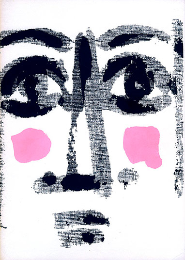
As those curious enough to leaf through the PDF I made from a copy in my personal collection will have noticed, this book contains a great many blank pages. The explanation lies in the structure of the layout. Each text is illustrated by an image, and the text and image are printed on one side only of a separate sheet. They face one another, tucked inside a four-page folder, whose first page bears the title of the text. The first six texts are by Michel Tabanou, who illustrated the first three; I illustrated the last three. The next six texts are mine: Tabanou illustrated the first three, and I illustrated the last three.
You are perfectly entitled to like it or dislike it. Make the most of that freedom, in every possible way, while you can. Before long, freedom of opinion may no longer be quite what it is today…
Those who know me vaguely, perhaps even those who think they know me rather better, or even know me well, not to mention the ordinary two-legged creatures who don't know me at all, are liable to think—when they think, that is, which not everyone does—that I am first and foremost a printer, and that, as a printer, I am nothing more than a foul-mouthed, backward-looking devotee of old-fashioned hot-metal typesetting. Or next to nothing else. If that's what you think of me, potential reader, assuming you actually exist, or young lady reader of my dreams, "ce que tu te goures, ce que tu te gourres" (Both spellings are possible in French, even though Queneau opted for the first.) Approximatively: boy (or girl), are you wrong! Wrong, wrong! Of course, there's a grain of truth in these misleading assumptions, but that's by no means the whole story.
I learned typography, because everything can be learned, even the trade of international criminal or head of state (which amounts to much the same thing). I learned it to make books, and only to make books, so that I could master every aspect of the process, from writing my own texts—or choosing someone else's—to the finished product, taking in the layout, any illustrations, the printing, and the folding of the printed sheets along the way. But before I learned that damned hot-metal typography, I had learned screen printing with some friends who, like me, had taken part in the events of May 1968. And it was by screen printing that I made my very first book.
The year was 1973. I was in my first year at Estienne, the Paris printing school, but I had already had my own screen-printing workshop for some time, a workshop I had built with my own fair hands, apart from the squeegees and the ink, which I bought from Tripette et Renaud. At Estienne in the 1970s, you simply did not talk about screen printing. Screen printing was taboo. Letterpress, offset, and rotogravure were our trinity of goddesses, to whom we were expected to give thanks at every hour of the day and night. Things have changed since then. Screen printing is now accepted there, and the religion of Estienne has become monotheistic. These days, they worship that cow, IO—or rather, 1 0—the goddess of all things digital.
So, 1973. Classes were over, summer was beginning, and with it came an overwhelming urge to make a proper book. I mentioned the idea to a friend (someone I rarely see these days), and we decided to work out the contents together. Twelve texts that might be called poems (or might not…), six by each of us. Each of us would illustrate three of our own texts and three of the other's. I would take care of the layout and the actual production, using screen printing, while my collaborator went off on holiday.
I was bursting with enthusiasm, filled with an indescribable happiness at the prospect of embarking on this adventure. It was my first real book layout, and I conceived it so that the book would be impossible to leaf through. When you hold it in your hands and try to turn the pages, all you see is blank paper. I was rather pleased with myself, I can tell you. I then hand-lettered the texts with a brush on the transparent film used to expose the screens, and turned our drawings into films for printing as well. July and a good part of August went by in the making of the book, right through to the final assembly. Sixty copies, in A4 format, five of them not for sale.
It was while making this book that I discovered the wonderful possibilities of manual screen printing. Of all printing techniques, it is the only one within the reach of ordinary mortals like us that allows white (or any other light colour) to cover black (or any other colour) without becoming dirty, remaining truly white or retaining its original hue. A quasi-mystical technique that makes immaculate conception possible, even for donkeys and great big oxen. A genuine miracle for those of sound mind!
To tell you that I am still proud of this book today would be an exaggeration. I still appreciate the practical achievement, certainly… but as for the contents… The title of the book is an exquisite corpse that my friend and I came up with together, the first and best of a little series. The cover drawing was done by Nicolas Stavropoulos, who was in charge of the visual arts workshop in Villejuif, where we attended classes in drawing—still life, the nude, clothed poses—and in lino and woodcut printing. We printed our engravings, of all things, on a lithographic press!
There is no need to be ashamed of one's early work. This book is the first tangible witness to an evolution that was my own. The same is true of anyone who ventures into creative work, unless he or she is irredeemably hopeless. So, here it is. I'm not passing judgment on it. I'm simply showing it to you.
As those curious enough to leaf through the PDF I made from a copy in my personal collection will have noticed, this book contains a great many blank pages. The explanation lies in the structure of the layout. Each text is illustrated by an image, and the text and image are printed on one side only of a separate sheet. They face one another, tucked inside a four-page folder, whose first page bears the title of the text. The first six texts are by Michel Tabanou, who illustrated the first three; I illustrated the last three. The next six texts are mine: Tabanou illustrated the first three, and I illustrated the last three.
You are perfectly entitled to like it or dislike it. Make the most of that freedom, in every possible way, while you can. Before long, freedom of opinion may no longer be quite what it is today…

L’homme au coin
10 pages,
format 8,5 x 8,5 cm.
tirage à environ 30 exemplaires en typographie au plomb.
Thomas Braun
des fromages
8 pages,
format 11,2 x 9 cm.
tirage à 131 exemplaires en typographie.
CLS
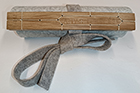
Un volumen,
79 cm de long, 17,5 cm de haut.
tirage à 10 exemplaires en linogravure.
Marie-Rose de France
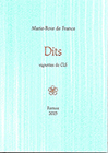
26 petits textes en proses poétique. Vignettes de CLS.
tirage à 120 exemplaires en typographie au plomb.
Marie-Rose de France
|
|
36 p., format 10 x 14 cm. composé et imprimé en typographie au plomb Tirage à 120 exemplaires. (cliquer sur l'image pour en savoir plus) |
... for those who are too lazy to seek.
14713716 visitors
4 visitors online
Fornax éditeur 18, route de Coizard, F51230 Bannes – France

